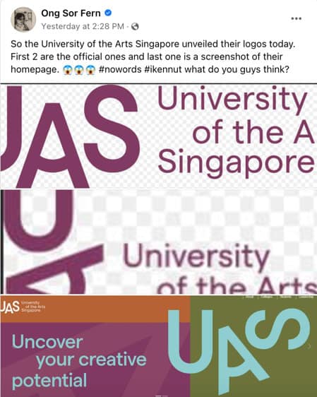
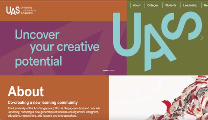
- New University of the Arts Singapore (UAS) introduces their logo, drawing some unhappiness.
- The logo, consisting of the letters “U”, “A” and “S”, meant to reflect the dynamism of an arts education.
- Public opinion swings both ways, with some defending the simplistic design, while others criticise it for lacking creativity.
Ah, hello lah! Let me tell you this story hor, about this logo.
Senior culture correspondent with The Straits Times, Ong Sor Fern recently posted something on University of the Arts Singapore (UAS) new logos.
#nowords #ikennut what do you guys think?
And it generated some debates among the commenters.

The Thing About Logos
So, dude, logos. They’re the face of the company, the first thing you see.
And when UAS, the new arts university in our lion city, showed their face, wah, many people didn’t really like what they saw.
The logo, got U, A, S only. Simple or lazy, that’s the question hor.
The ‘Lazy’ UAS Logo
Some folks, like our friend Jen, say the logo look like those random alphanumeric thingeys you see when the internet want to check if you human or robot.
Sharon, another fellow, could only say “Um…”
Bro, even the author, Ong Sor Fern, cannot laugh because she say it’s too depressing.
Aiyoh, so jialat meh?
The Defense
But hor, not everybody think it’s terrible lah.
Some people say maybe UAS going for simplicity.
Maybe they don’t want their logo to be all “haiya, look at me!”
Maybe they want it to be like the quiet kid in the corner who’s actually super cool once you get to know him. Maybe, right?
Art or Nah?
Then, you got people like Angela, who expect a logo from an arts university to be creative, visually appealing, and maybe a bit cheeky.
She say this logo look like a Pri School kid’s last-minute homework.
But Clara, another gal, she stand up for UAS.
She say Angela and others like her are just repeating the same old criticisms.
You know, the ones like “My kid could paint that!”
She say maybe this logo is what people will talk about. Who knows, right?
The Big Picture
But at the end of the day, it’s not about who’s right or wrong, lah.
It’s about what this logo says about UAS, about our arts scene, about us as Singaporeans.
So, here’s my question to you: Do you think the UAS logo is a lazy effort or a stroke of minimalist genius?
Let’s chat in the comments, bro!


